
In recent years, there has been a significant advancement in the field of Artificial Intelligence (AI) and Augmented Reality (AR). These technologies have become increasingly popular and have the potential to enhance virtual experiences in various fields such as gaming, education, healthcare, and...
AI Designed a Font Specifically for People with Visual Impairments
93
31.05.2026
Why typography matters for visual accessibility
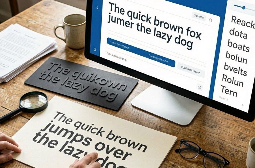
For people with visual impairments, reading comfort depends heavily on letter clarity, spacing, and contrast. Even small typographic details—like similar letter shapes or tight kerning—can significantly reduce readability.
Standard fonts are often designed for aesthetic balance or general readability, not for accessibility under low vision conditions.
This creates a need for specialized typefaces that prioritize recognition speed and character distinction.
How AI approaches font design
Artificial intelligence can analyze how different letterforms are perceived by users with varying levels of vision impairment. Instead of relying solely on human typographic tradition, the system optimizes shapes based on readability performance data.
The AI generates multiple font variants and evaluates them through simulated and real-world reading tests.
Data used in the design process
- Eye-tracking studies of reading behavior
- Readability tests with low-vision participants
- Character confusion matrices (which letters are mistaken for others)
- Contrast sensitivity models
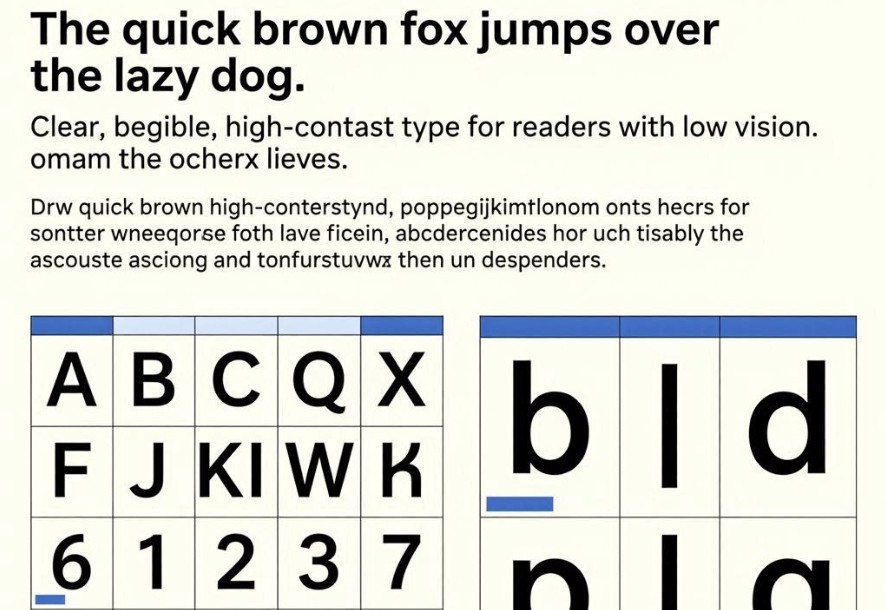
What the algorithm optimizes in letterforms
The system focuses on maximizing distinguishability between characters while maintaining natural reading flow. It modifies shapes, spacing, and proportions to reduce ambiguity.
Key typographic adjustments
- Increased spacing between letters and words
- Enhanced differentiation of similar characters (e.g., “O” vs “0”)
- Simplified stroke structures for clarity
- Adjusted x-height for better legibility
How AI evaluates readability
Each generated font is tested using predictive models that estimate reading speed and error rates. Some systems also incorporate human feedback loops to validate performance improvements.
The best-performing designs are iteratively refined through multiple generations.
Evaluation workflow
- Generation of font candidates
- Simulation of reading scenarios
- Error and confusion analysis
- User testing with accessibility groups
- Refinement of letter shapes
Why AI improves accessibility design
Traditional font design relies on expert intuition and visual aesthetics, which may not fully capture the needs of visually impaired users. AI introduces data-driven optimization based on actual performance metrics.
This allows designers to systematically reduce reading errors rather than relying on subjective judgment alone.
Benefits of accessibility-focused fonts
Main advantages
- Improved reading speed for low-vision users
- Reduced character confusion
- Better accessibility across digital platforms
- Enhanced comfort during long reading sessions
Limitations of AI-generated typography
While AI can optimize readability, it must still balance accessibility with aesthetic diversity. Over-optimization can sometimes lead to fonts that feel visually uniform or less expressive.
Additionally, different types of visual impairments may require different typographic solutions.
Future of accessible design
Future systems may generate fully personalized fonts tailored to individual users based on their specific vision profiles, device settings, and reading habits.
Conclusion
AI-driven font design represents a major step forward in digital accessibility, enabling typography that is not only visually coherent but also optimized for inclusivity and readability.